THUNDER: THRONE WARS
UI/UX Design
Thunder: Throne Wars was a pre-alpha game that was being developed by IMU Studios. The game was presented to a team of 4 UI/UX designers for a user interface and user experience evaluation and a design treatment based on the evaluation. The end goal was to provide a design solution for IMU Studios.
Research
The team initially set up a meeting with IMU Studios to get insights into Thunder: Throne Wars. Then, the research on the suitable audience and market for the game and the analysis on the game prototype were conducted simultaneously. During the research period, the team kept regular communication with staff at IMU Studios via Discord.
User Personas

Based on the research, the team created user personas to outline a clear and accurate representation of the game and its shortcomings.
User Journey Maps

User journey maps were also created for the same purpose as the personas. Both were designed iteratively and with the IMU Studios’ advice taken into consideration.
Design Solution Brainstorming
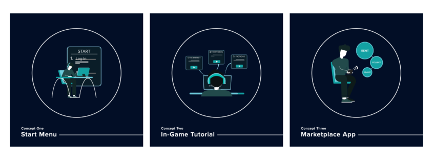
Based on the research, the team identified several issues within the game interface that could cause issues and impact the user experience. Potential design solutions were brainstormed and prepared for IMU Studios.
Participatory Workshop
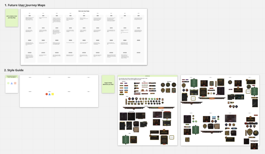
The team hosted a participatory workshop with members of IMU Studio on Discord and Miro to present the findings and design solutions and narrow down the ideas by doing three activities together. The goals of the activities were to solidify the user journey with the IMU Studios team and learn IMU Studios’ design preferences.
During the workshop, the team also learned some limitations regarding the time constraint and the development progress of the game, which helped the team later in constructing an ideal design solution for IMU Studios.
Design Solution Focus
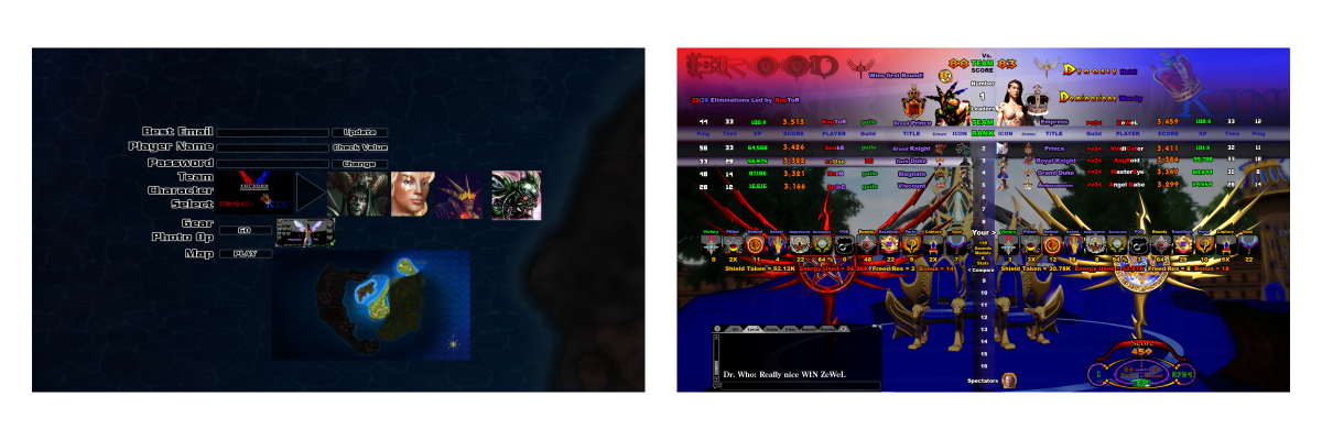
The main issue identified was the inconsistent design of the game interface, which caused many usability issues. The team believed it was of utmost priority to create a base model for IMU Studios that could function as a design and style guide for their future consistent game interface design. After gaining support from IMU Studios, the team decided to redesign the start menu of Thunder: Throne Wars for IMU Studios to use as the design and style guide.
User Journey Framework

Before designing the start menu, the team created a user journey framework to help visualize the necessary steps for the start menu and evaluate the usability of the start menu.
This user journey framework was designed iteratively and saved the team a lot of time in designing the start menu.
Start Menu Redesign
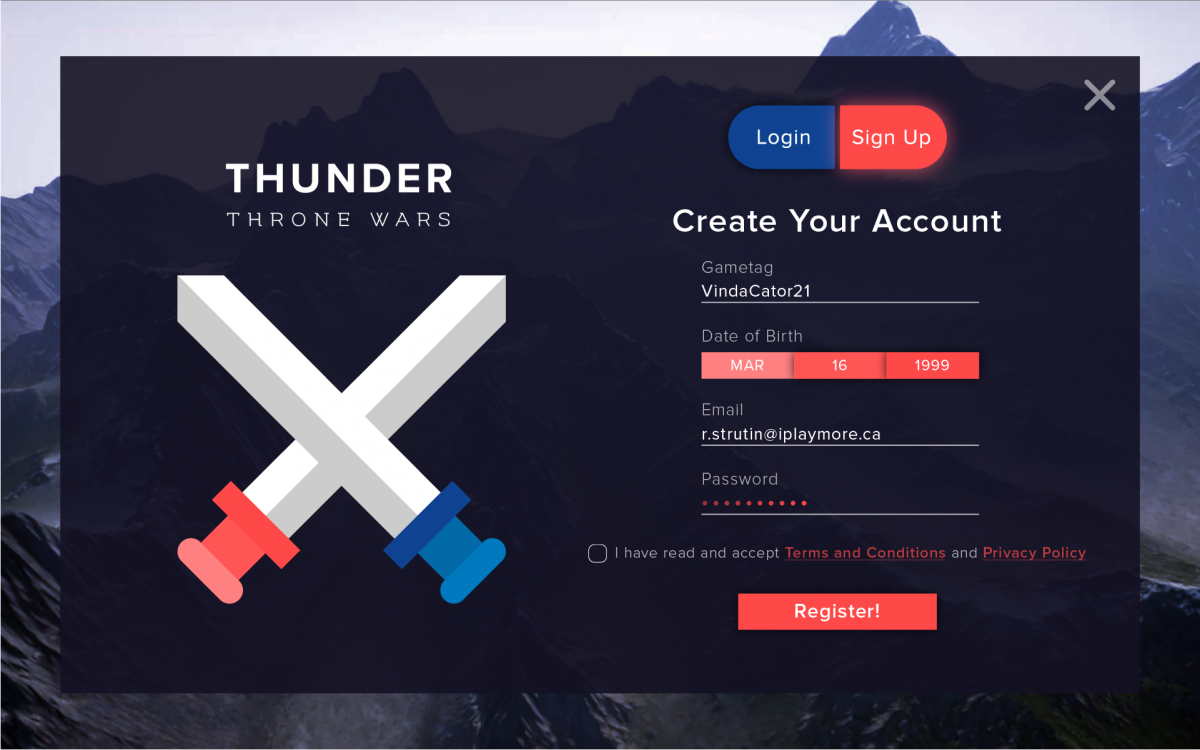
The redesigned start menu used a colour palette that accurately reflected the branding of the game. The login and sign up process were redesigned to be shorter, faster, and clearer with a clean and pleasant layout and information hierarchy.
The product was presented on time and received praise from IMU Studios.